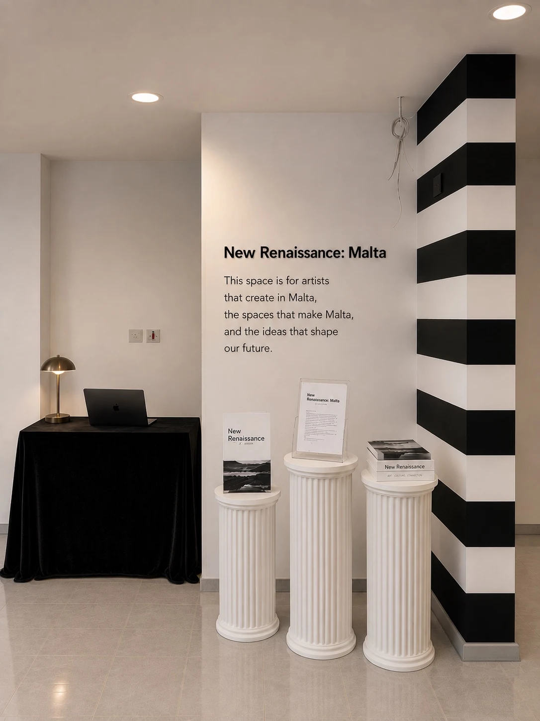
A venture studio can have a recognizable point of view without making every company look the same. At Interesting Concepts, the black-and-white studio identity provides a shared frame. The companies carry their own colors, language, and character. The Clearcut example below connects this question to a specific company in the Interesting Concepts portfolio.
Begin with the audience’s world
Someone organizing invoices arrives with different expectations from someone exploring cultural patronage. The information they need, the pace at which they make decisions, and the signals that help them feel oriented will differ.
Brand decisions should begin there. Before choosing a color, ask what the company needs to communicate. Is the experience about clarity under time pressure? Thoughtful exploration? Continuity across complicated work? The visual language should support that purpose.
A shared owner does not imply a shared voice
Clearcut, Gather, and HeadsUp belong to Interesting Concepts, but their users arrive with different concerns. Clearcut needs to explain a commercial change without making the relationship feel adversarial. Gather needs to make a request approachable. HeadsUp needs to make a deadline and its consequences easy to understand.
Those differences should affect language, visual emphasis, and the first action on the page. A common template is a useful starting point for consistency. It becomes a limitation when every company inherits the same promise, the same illustrations, and the same vague call to action.
Share standards, not every surface
The most useful common standards are often the ones a visitor never names. Clear navigation. Readable type. Honest descriptions. Accessible controls. A predictable way to get help.
These standards can travel across a portfolio while the visible identities remain distinct. A company can feel lively, quiet, technical, or expressive without compromising the basic quality of the experience. Shared discipline gives each identity a stronger foundation.
Give difference a reason
Difference alone is not a strategy. A palette or typeface should help the company become understandable and recognizable. If the design choice cannot be connected to the audience or purpose, it may be decoration rather than direction.
Consider a simple review exercise: remove the logo and read the page. Does its language still sound appropriate to the company? Does the order of information reflect what its audience needs? Now restore the visual identity. It should strengthen those decisions, not try to rescue them.
Keep the parent relationship legible
Independence does not require hiding the studio. A clear statement that a business is an Interesting Concepts company gives visitors a route to the broader portfolio and its operating philosophy.
The relationship should be easy to find without overwhelming the company’s own proposition. The visitor came to understand a particular business. Explain that business first, then make its connection to the studio available where it adds context.
Design for continued use
Identity extends into small, repeated moments: an empty state, a confirmation, a reminder, a help message. A company that sounds considered on its homepage but careless when something fails has an incomplete brand experience.
This is where a shared studio can be especially useful. Reviewing those moments across several companies can reveal better standards without forcing visual uniformity. The goal is a portfolio whose members feel related through the quality of their decisions. Each should still be recognizable as itself.
Build a small identity system
A practical identity system can begin with four decisions: the promise, the voice, the visual cues, and the interaction standards. The promise says what the company helps someone achieve. The voice determines how it explains that work. Visual cues make it recognizable. Interaction standards determine whether the experience feels considered when someone actually uses it.
Document these decisions with examples rather than abstract adjectives alone. “Clear” becomes more useful when it is accompanied by a sample confirmation, an error message, and a headline. “Distinctive” needs a recognizable application, not just a mood board. A compact set of examples gives future contributors a way to make consistent choices.
Review the same moment across companies
Choose a moment that appears in several businesses, such as a first visit, an empty workspace, or a successful submission. Review whether each experience explains the next step and respects the user’s attention. The wording and visual treatment can differ while the standard of care stays consistent.
This review may reveal a shared problem: perhaps every company asks for too much information before explaining the benefit. Fixing that pattern is more valuable than making the buttons identical. The studio’s contribution is the quality of the question it brings to each business.
Protect recognition as a company grows
As new pages and features arrive, an identity can slowly lose its shape. A periodic review should ask which elements still carry recognition and which have become inconsistent. Keep what supports comprehension, and revise what no longer serves the company’s audience.
An independent brand is not a collection of permanent stylistic rules. It is a coherent relationship between purpose and expression. The studio can help maintain that relationship while leaving each company enough room to evolve.
Consistency belongs beneath the identity
Shared standards can cover accessibility, clear error messages, accurate product descriptions, and reliable account handling. These help the customer without requiring every product to look alike. Distinct company marks and colors then make movement across the portfolio easier to recognize.
The editorial test is straightforward: remove the company name from a paragraph and ask whether it still describes that company specifically. If it could sell any software product, rewrite it around the customer’s actual task. Interesting Concepts should connect the portfolio without erasing the reason each company exists.